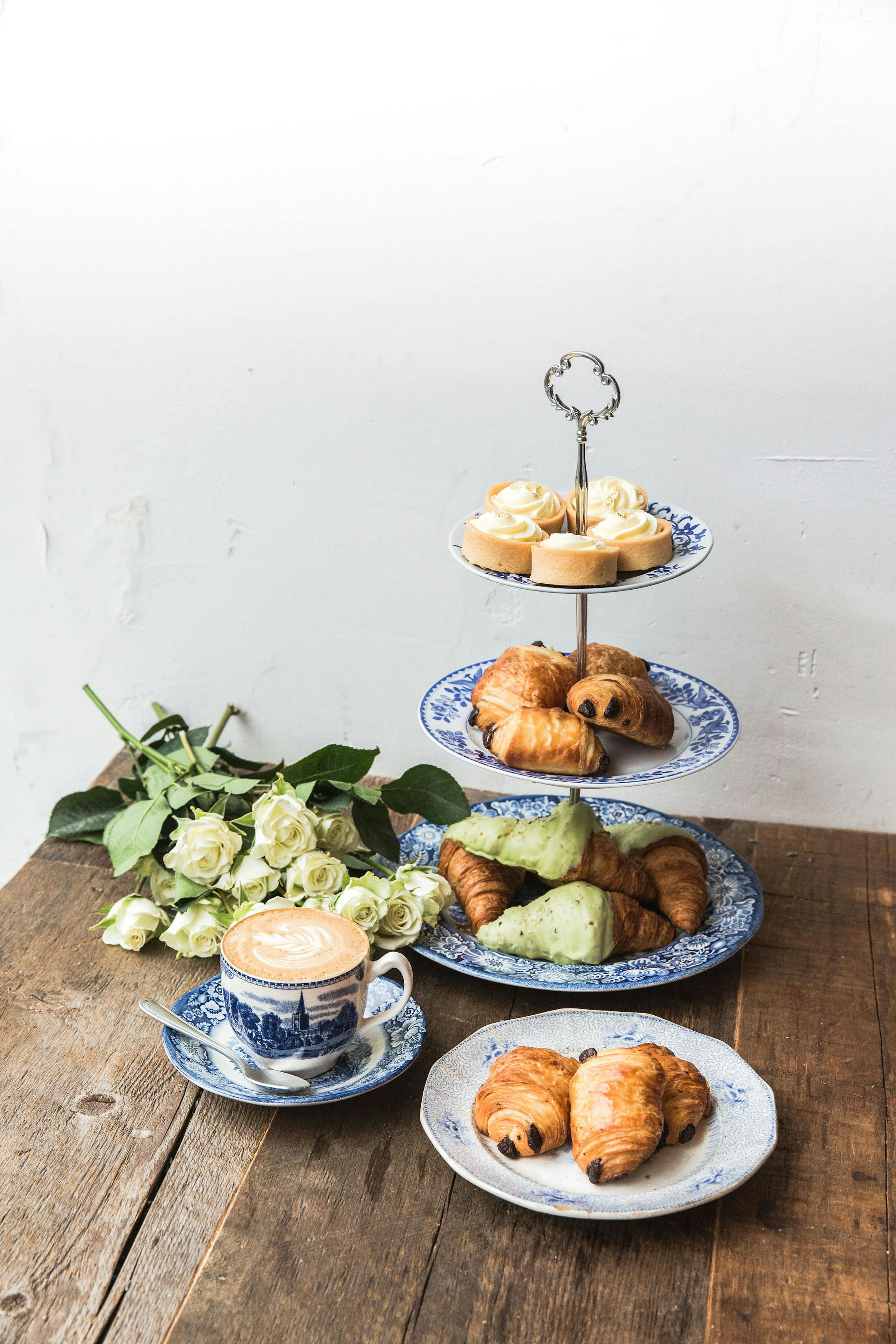
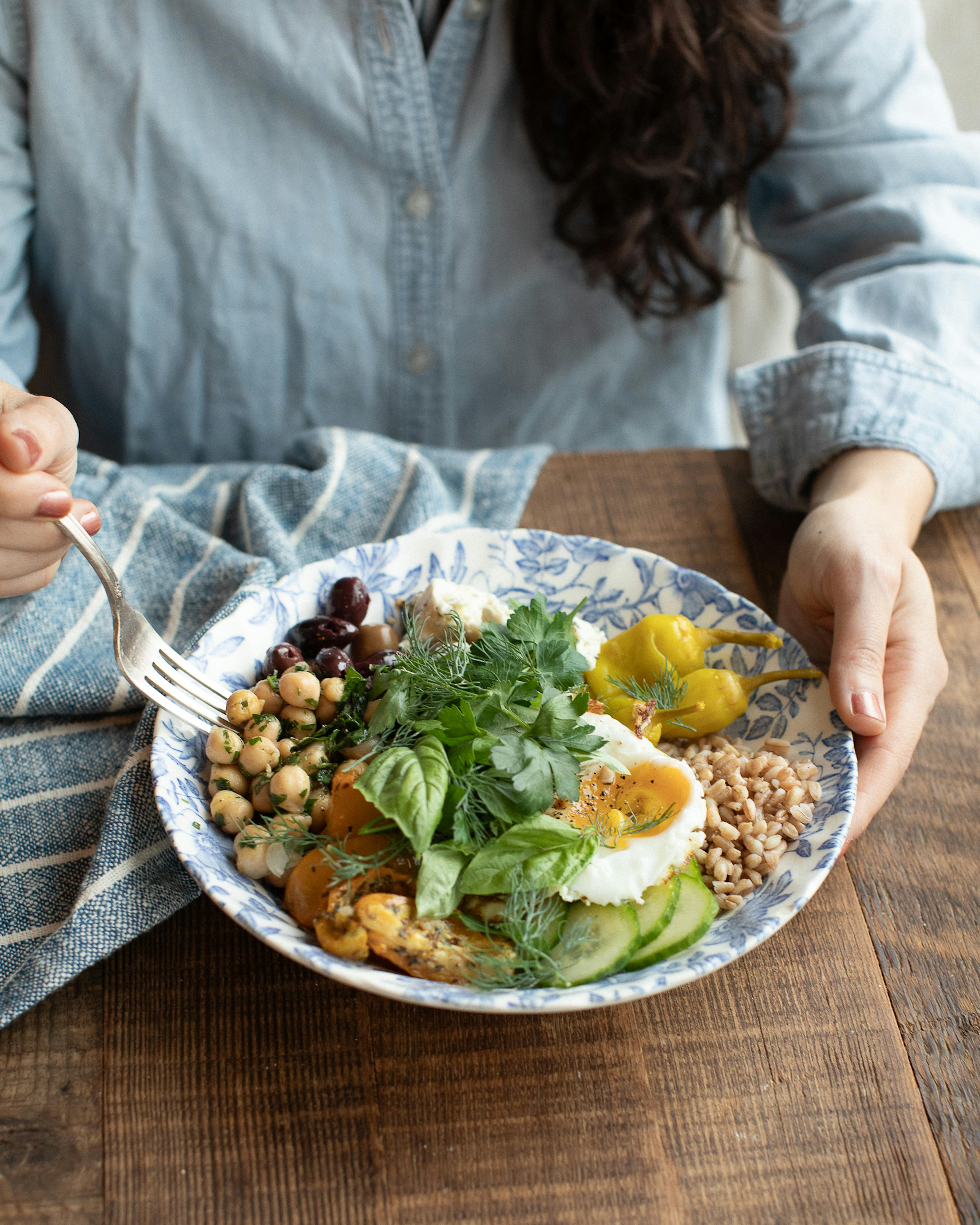
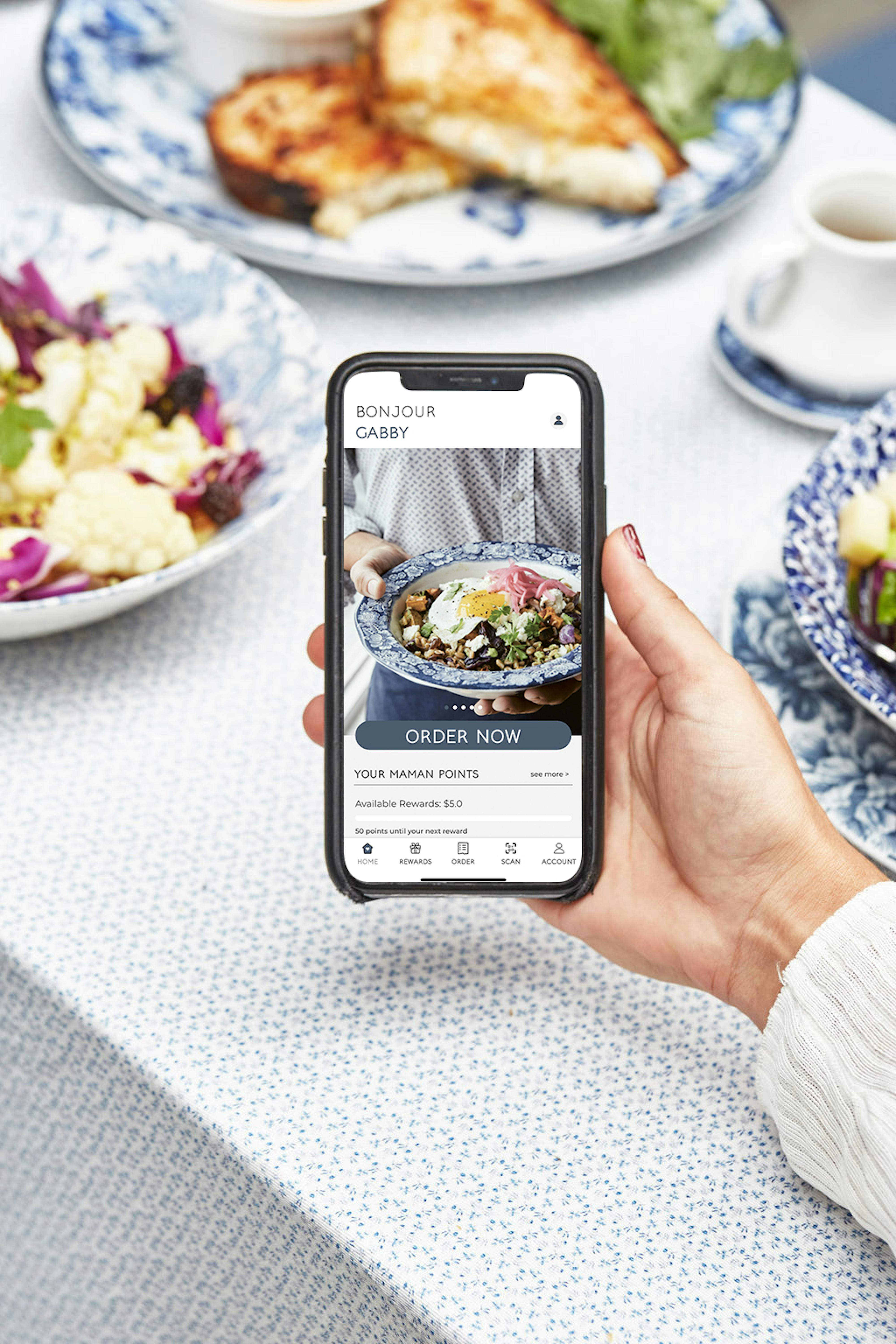
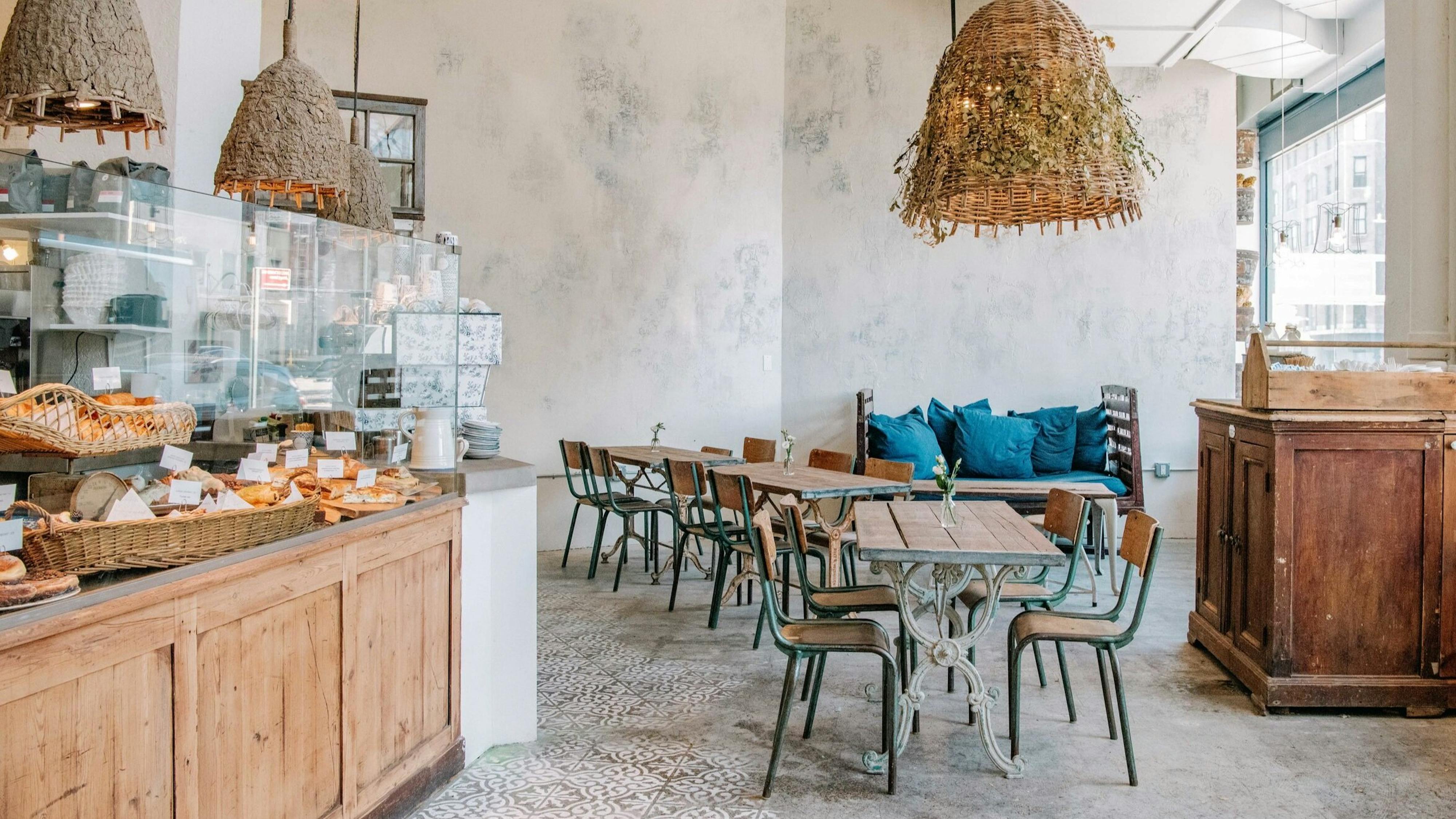
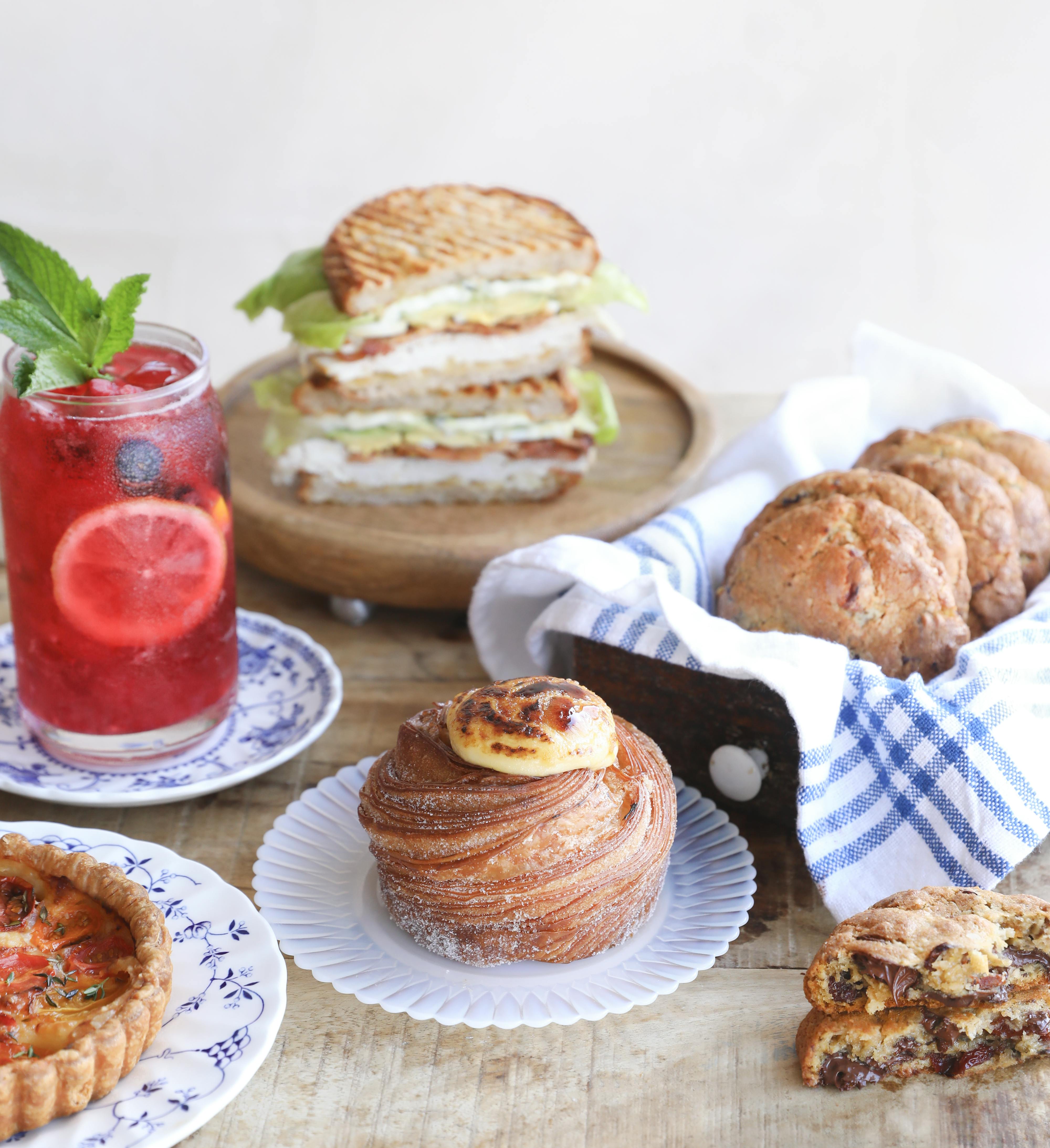


as maman began its journey at 239 centre street in soho back in 2014, owners benjamin sormonte and elisa marshall wanted to make sure that every detail of their beloved brand had a personal touch to them. although maman has grown to over 20 locations since the soho café first opened its doors, the personality of the brand has remained a focal point for the maman team. that’s why they brought in designer candice kaye (_@candicekaye_) to help them create personalized patterns that evoked the humble, homestyle origins of maman. here’s a guide to the four major patterns that you will see when you walk into any maman.
toile
toile patterns accent the interiors of maman’s many cafés & feature hand-drawn birds, rabbits, and flowers. this pattern was designed as a nod to ben’s french heritage & his favorite childhood animals. not to mention it’s very on trend – hello grandmillenial style!

stripe
maman’s stripe pattern colors the many coffee cups scattered around the city. a whimsical, minimalist pattern, this design was created as a fun take on the traditional american stripe but with a waterstroke twist. maman may have french influences, but this pattern pays tribute to their home in america.

tile
maman’s trademark tile pattern is the design that started it all. ben and elisa’s past travels to spain influenced this iberian-style print, and the tile that inspired this design still resides in the soho washroom!

floral
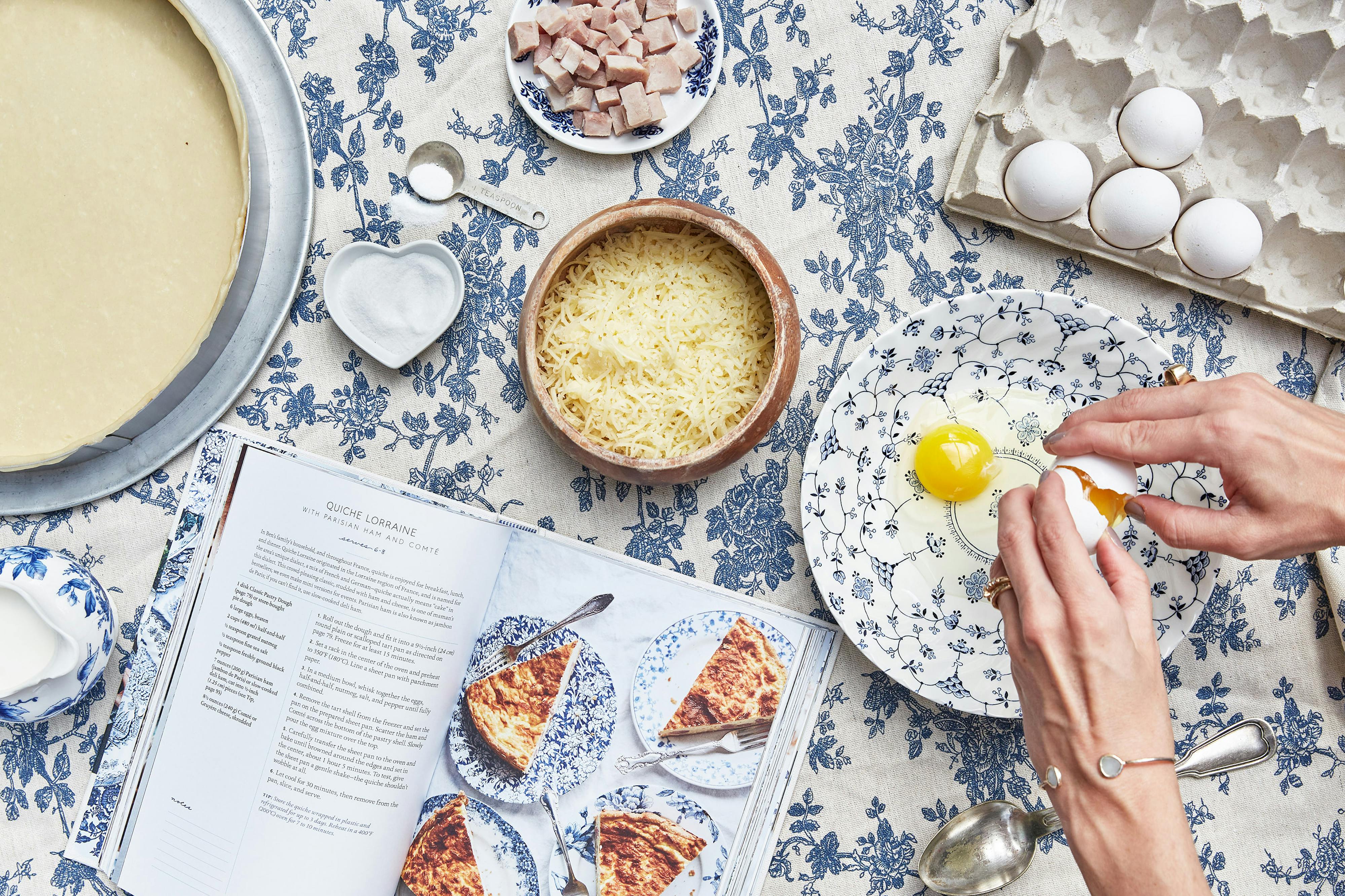
maman’s timeless floral pattern can’t help but flourish in each café. this abstract pattern beautifully blends the backgrounds of maman’s owners, featuring ben’s mother’s favorite flower, the rose, alongside elisa’s mother’s favorite flower, the peony.
